All Latest 608 A/B Tests
Become a member to unlock the abiltiy to see the highest impact a/b tests. Being able to see the actual test results and sort by impact allows growth and experimentation teams to take action on the biggest gains first
MOST RECENT TESTS
Test #324 on
by  Jakub Linowski
Oct 30, 2020
Desktop
Mobile
Product
Jakub Tested Pattern #17: Least Or Most Expensive First


This experiment tested the order of purchase plans. The control version sorted the purchase options by the least expensive while the variation sorted them by the most expensive first. Impact on sales and revenue was measured.
Test #323 on
Backstage.com
by  Stanley Zuo
Oct 29, 2020
Mobile
Signup
Stanley Tested Pattern #117: Company Logos On Backstage.com


In this experiment, the variation replaced a text testimonial with high-profile production companies that have cast with Backstage. The logos were shown during the signup and checkout flow.
Test #322 on
Thomasnet.com
by  Kyle Phillips
Oct 27, 2020
Desktop
Mobile
Product
Kyle Tested Pattern #82: Onboarding Callouts On Thomasnet.com
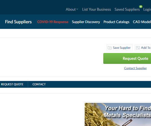
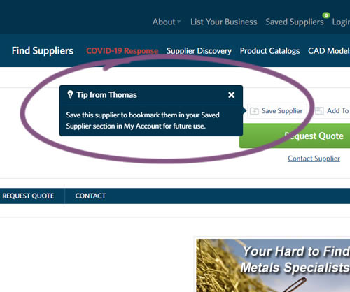
This experiment variation prompted users to save (bookmark) a company profile on a company detail page. Clicking on the save feature while logged out, would prompt a registration modal. Hence the save feature acted as an extra reason to signup. The number of people engaging or interacting with the feature was measured, as well as registrations.
Test #321 on
Elevate App App
by  Jesse Germinario
Oct 23, 2020
Mobile
Jesse Tested Pattern #11: Gradual Reassurance
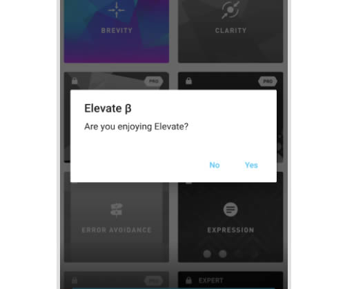
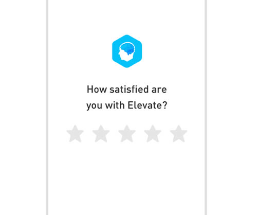
This experiment aimed to increase the number of application ratings from within the Elevate app. Success was measured by the number of users going towards Google Play to create the rating. The control version prompted users if they wanted to rate the app with a simple yes and no answer. The variation however presented the rating choice right away in the form of 5 stars - enabling users to express their choice sooner.
Test #320 on
by  Jakub Linowski
Oct 20, 2020
Desktop
Checkout
Jakub Tested Pattern #49: Above The Fold Call To Action


An extra "Place Order" button was duplicated above the fold on this checkout page. The control had a similar button further down at the bottom of the screen. The impact on total sales was measured from this change.
Test #319 on
Backstage.com
by  Stanley Zuo
Sep 30, 2020
Desktop
Pricing
Stanley Tested Pattern #113: More Or Fewer Plans On Backstage.com
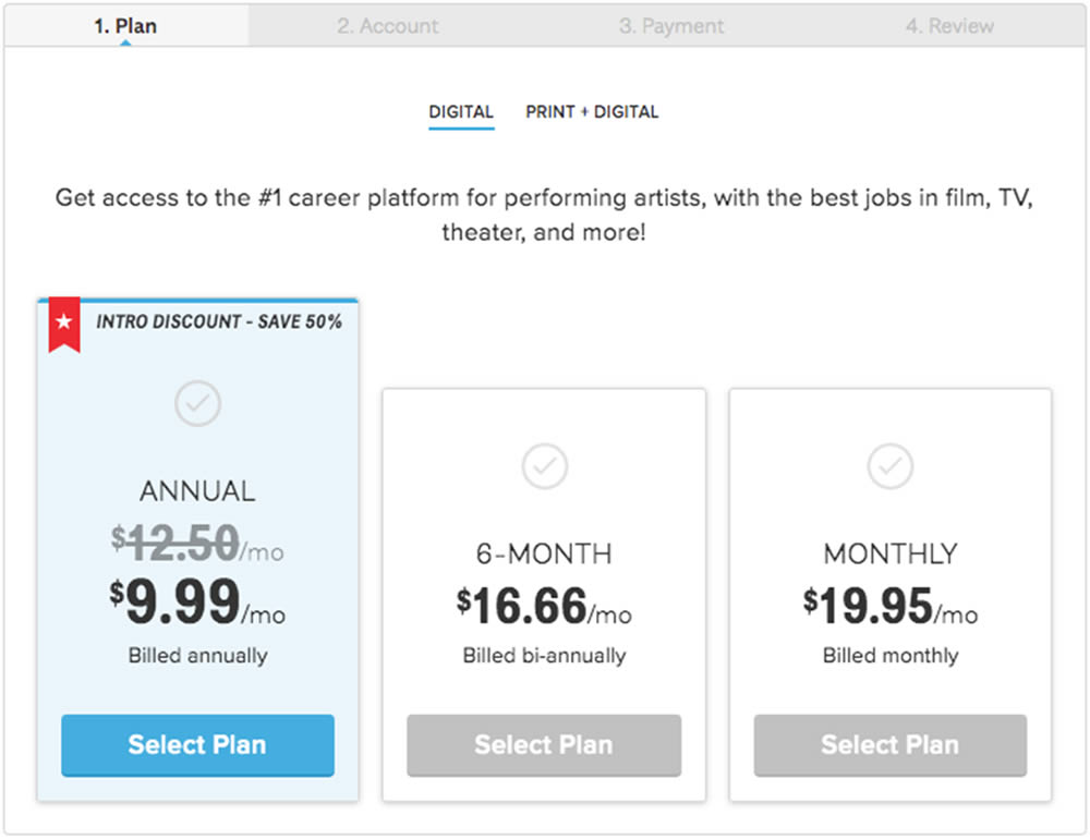
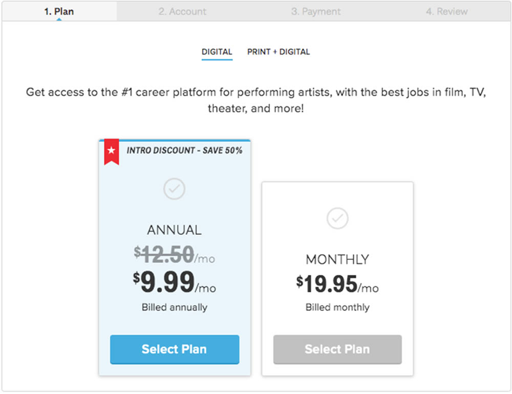
In this experiment, a 3 plan vs 2 plan pricing page was shown to potential customers. Impact on sales and revenue were measured.
Test #318 on
Thomasnet.com
by  Kyle Phillips
Sep 29, 2020
Desktop
Mobile
Content
Kyle Tested Pattern #60: Repeated Bottom Call To Action On Thomasnet.com
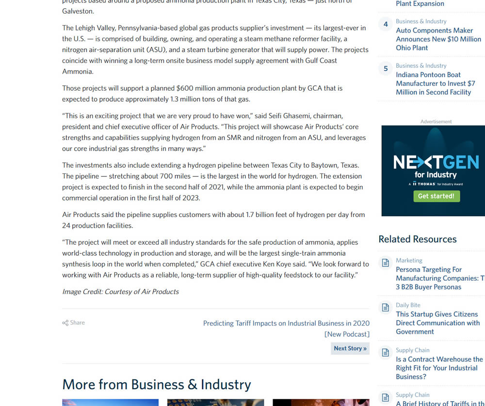
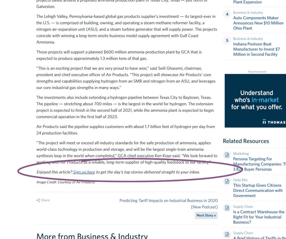
In this experiment, a simple link to a newsletter signup landing page was added at the bottom of an article. The newsletter landing page then encouraged users to provide their email address for future article updates.
Test #317 on
Volders.com
by Michal Fiech
Sep 28, 2020
Mobile
Signup
Michal Tested Pattern #119: Unselected Or Selected Defaults On Volders.com
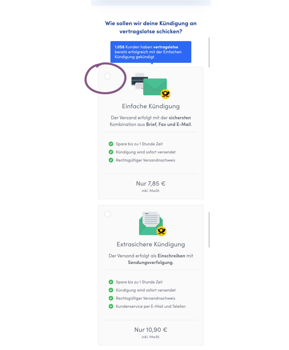
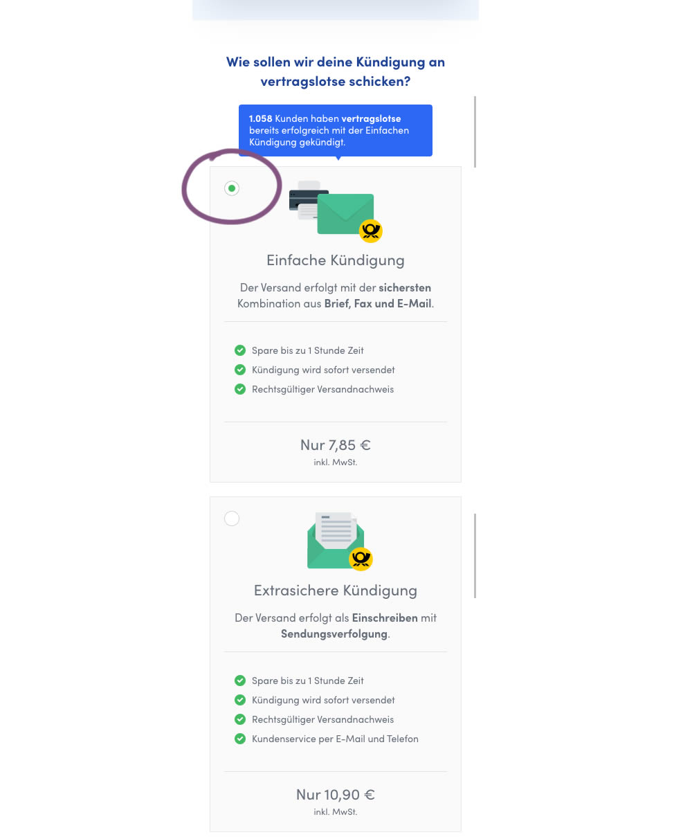
In this mobile experiment, an unselected vs selected payment plan was tested for its impact on sales. The experiment ran on a mid page of a signup funnel where customers were being asked to select one of two payment plans.
Test #316 on
Trydesignlab.com
by  Daniel Shapiro
Sep 24, 2020
Desktop
Mobile
Home & Landing
Daniel Tested Pattern #22: Empowering Headline On Trydesignlab.com


In this experiment, the headline was changed to focus more on the end-goal of the UX Academy program - that of landing your first UI/UX role.
Test #99 on
Vivareal.com.br
by  Rodrigo Maués
Sep 23, 2020
Desktop
Mobile
Product
Rodrigo Tested Pattern #24: Visible Availability On Vivareal.com.br
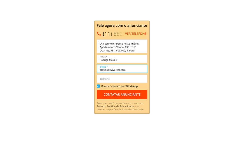
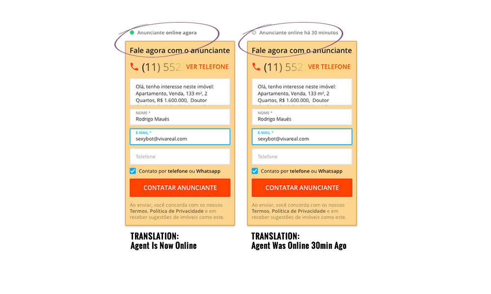
In this experiment, a lead form on a listing page showed whether an agent was recently online or not. The diplayed had two statuses: either indicating that someone is online now, or the most recent time they were online in minutes.
Test #315 on
Backstage.com
by  Stanley Zuo
Aug 22, 2020
Mobile
Signup
Stanley Tested Pattern #7: Social Counts On Backstage.com


In this experiment, a dynamic number of job postings was displayed during the signup process - reinforcing the value of signing up for membership access.
Test #314 on
Zapimoveis.com.br
by  Vinicius Barros Peixoto
Aug 21, 2020
Desktop
Mobile
Product
Vinicius Tested Pattern #43: Long Titles On Zapimoveis.com.br
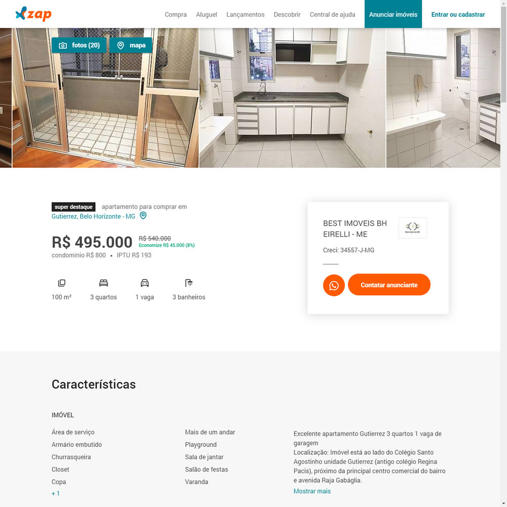
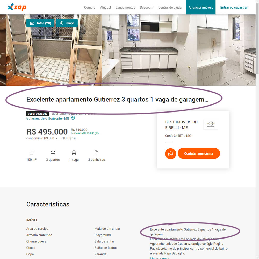
In this experiment, a dynamic page title was generated and added at the top of the screen. The first few words from a property description were used to dynamically generate these titles. The effect on leads was measured.
Test #313 on
Trydesignlab.com
by  Daniel Shapiro
Aug 19, 2020
Desktop
Mobile
Home & Landing
Daniel Tested Pattern #11: Gradual Reassurance On Trydesignlab.com

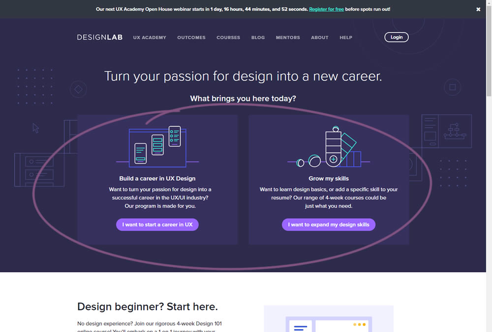
In this experiment, instead of showing a single-focused lead form (for the UX Academy Program), users were asked to express a wider set of choices first (for the UX Academy or shortter set of skill-based courses). The experiment measured overall leads for both types of programs.
Test #312 on
by  Jakub Linowski
Aug 14, 2020
Desktop
Mobile
Product
Jakub Tested Pattern #83: Progressive Fields


In this experiment, we tested a visible "Shipping Frequency" (A) option against a progressively displayed one (B) that would only appear after someone first chose a duration option. Thus in variation B, the buy box component would initially appear with fewer fields and smaller. The experiment measured initial progression and actual sales.
Note on the data: the experiment was run a little shorter than usual, as one of the variations triggered a stop rule to protect losses (so the effect might be somewhat inflated from a lower power).
Test #311 on
Backstage.com
by  Stanley Zuo
Aug 11, 2020
Desktop
Mobile
Home & Landing
Stanley Tested Pattern #118: Category Images On Backstage.com


In this experiment, category links (linking to casting call search results) were replaced with tile images. In addition, 2 levels of categories were also replaced with a single text link for each tile. Finally, the font size of the link titles was also increased.
Test #310 on
Backstage.com
by  Stanley Zuo
Jul 25, 2020
Mobile
Listing
Stanley Tested Pattern #77: Filled Or Ghost Buttons On Backstage.com


In this experiment, the style of a button leading to view detailed casting calls on a listing page was changed. In the A version the style was a filled high contrast blue background, and the B variation had a feint "ghost button" style.
Test #309 on
Thomasnet.com
by  Julian Gaviria
Jul 24, 2020
Desktop
Listing
Julian Tested Pattern #72: Priming Step On Thomasnet.com
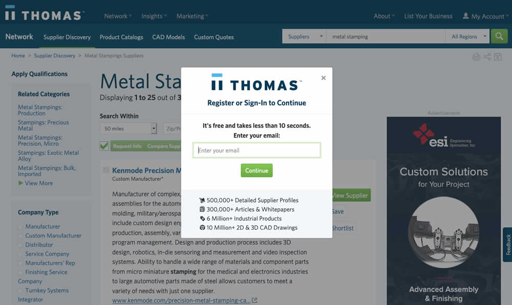
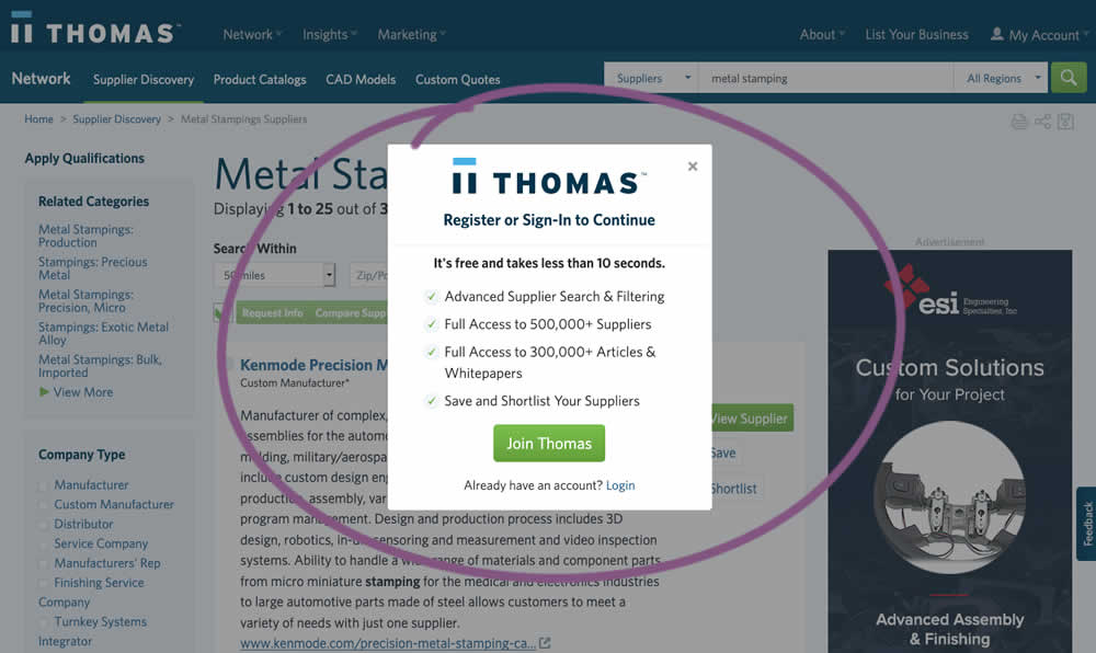
In this experiment, an extra step was prepended at the beginning of a multiple step signup modal flow. The signup modal would appear on listing pages after requests to contact a listed company. The idea was to prime users with benefits of signing up in order to increase their motivation to do so. The experiment measured the impact on the initial progression (to the step with the email form).
Test #308 on
Umbraco.com
by  Lars Skjold Iversen
Jul 23, 2020
Desktop
Home & Landing
Lars Tested Pattern #4: Testimonials On Umbraco.com
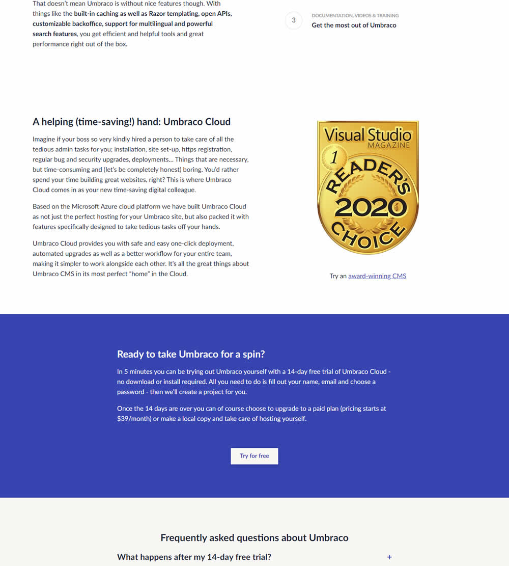
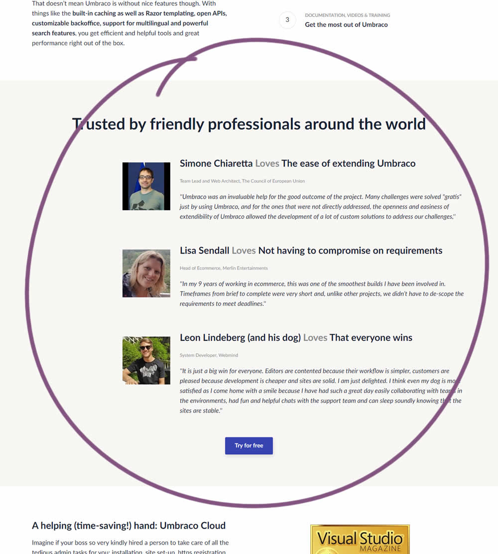
In this experiment, three testimonials were added mid way though on a CMS landing page. At the end of the customer testimonials an additional trial signup button was also added - which was also the primary metric.
Test #307 on
Volders.de
by Michal Fiech
Jul 17, 2020
Desktop
Thank You
Michal Tested Pattern #77: Filled Or Ghost Buttons On Volders.de
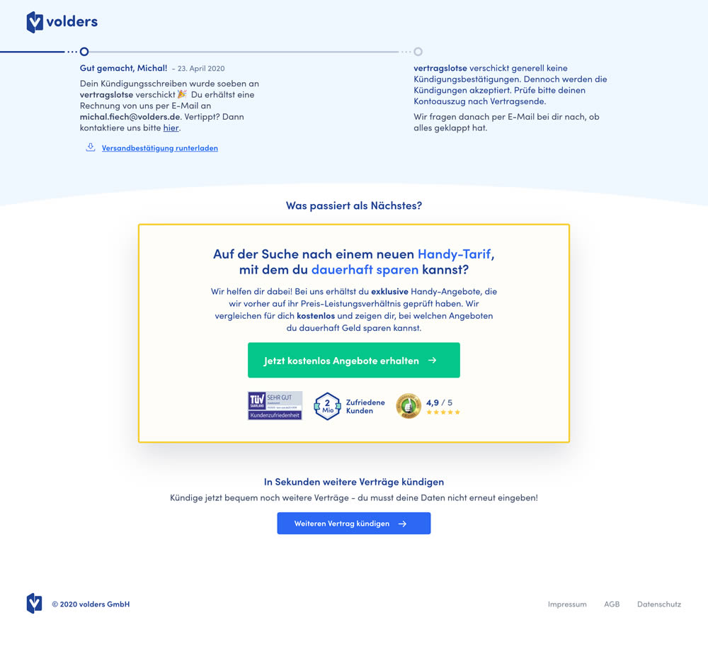
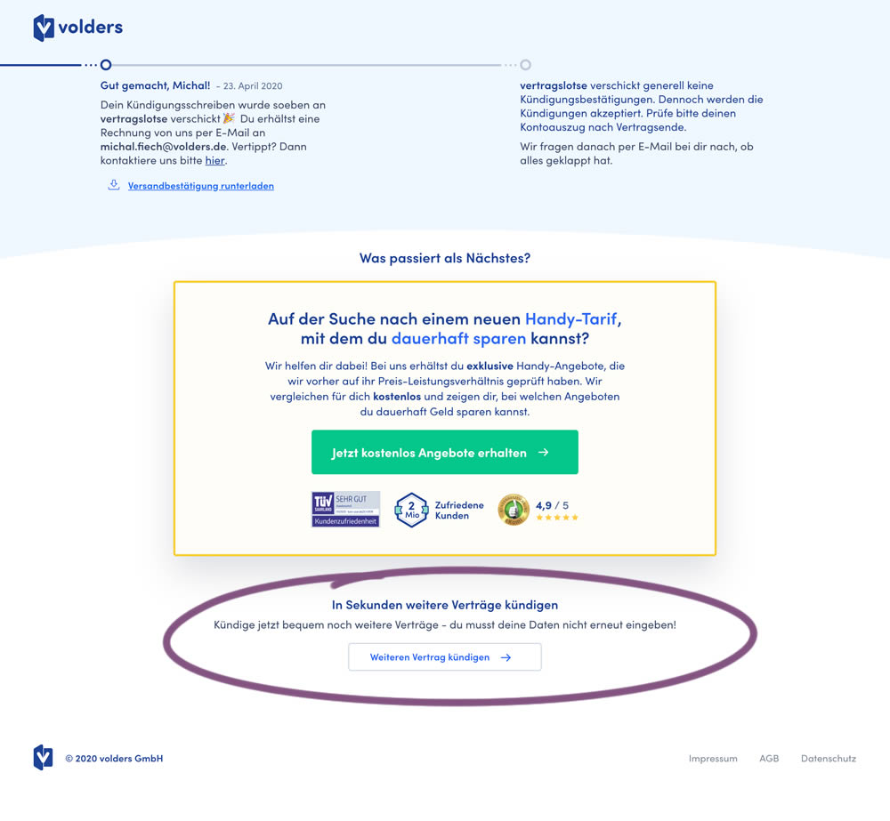
This experiment measured a shallow click goal on a button that would encourage to repeated the action that was just completed (in this case a contract cancellation). In the control version (A) a thank-you screen shows a filled button style, and the variant (B) there was a ghost button. As a note, I also flipped the A-B in this experiment for the purpose of matching it to our ghost button pattern, which means that Volders in fact was starting out with a ghost button to begin with.
Test #306 on
Backstage.com
by  Stanley Zuo
Jul 09, 2020
Desktop
Mobile
Pricing
Stanley Tested Pattern #69: Autodiscounting On Backstage.com
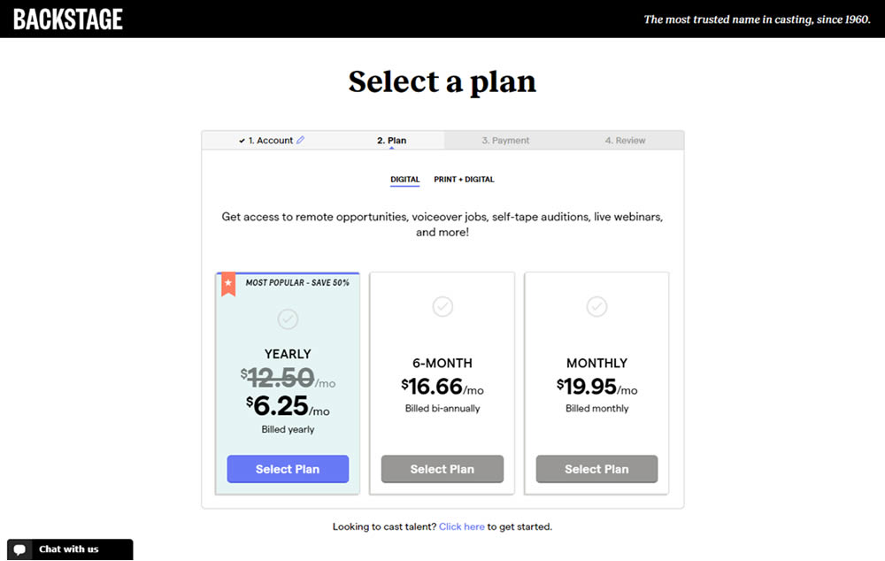
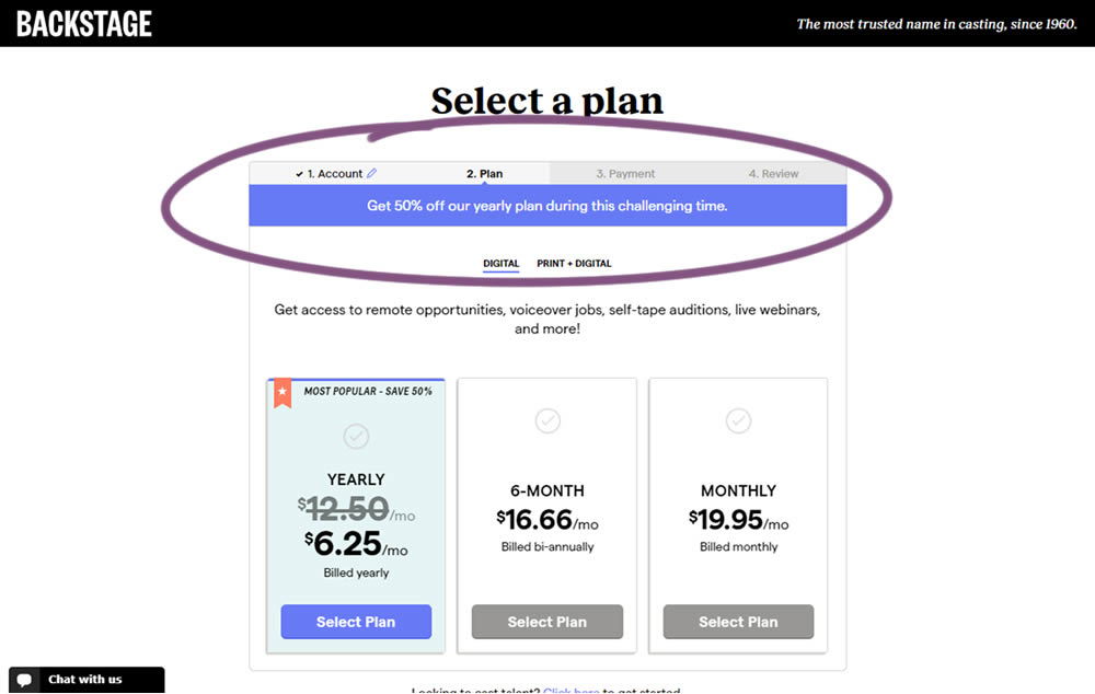
In this experiment, the only change was an added message at the top of the pricing screen, clarifying that there is an active discount on a yearly plan. The discount was already communicated with a strike-through price on the control version as well. The variation simply emphasized this aggressively.